Advanced plotting
Last revision: January 11, 2017In this last part of the tutorial, we are going to discuss more about plotting in octave. This part is optional. But when you see the pictures, I hope you’ll feel compelled to try it :)
Multiple plots
What if we are asked to plot many functions on the same panel? For example, someone has informed us that the carotid functions $f_n(x)=\cos(n x \arccos(x))$ are really interesting, most of all in the region $n = [-0.59,-0.56]$, and that a very beautiful plot comes out if you show them all together…
We can do a loop in order to show them all, and use the hold on
command so that the images are combined:
> hold on
> x=-0.59:0.00001:-0.56;
> for n=1:100
>     y=cos(n*x.*acos(x));
>     plot(x,y)
> endfor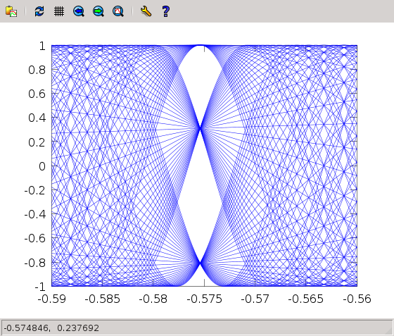
Exercises
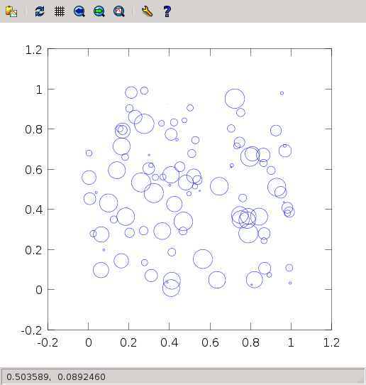
- Plot one hundred circles with random positions within in the unit square, and random radii in [0,0.05]. You should get something like this:
Surface plots
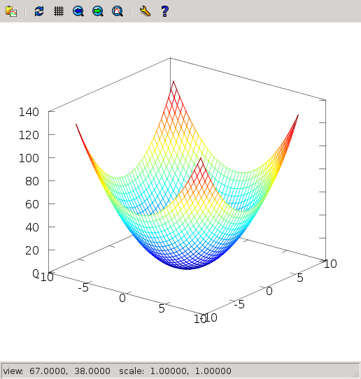
If a function depends on two variables, $x$ and $y$, we can depict them as a surface. For example, $f(x,y)=x^2+y^2$. How does it look like? In this case, I prefer to just give the recipe, and explain a bit afterwards
> x = -8:0.4:8;
> y = -8:0.4:8;
> [xx,yy] = meshgrid(x,y);
> z = xx.^2 + yy.^2;
> mesh (x,y,z);
The figure that you have obtained is 3D and it can rotate, if you click and drag with the mouse. You can get this:
Exercises
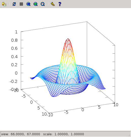
- For each point of the plane $(x,y)$ define its distance to the center, $r=\sqrt{x^2+y^2}$. Now plot $f(x,y)=\sin(r)/r$. The result should be something like this:
Animations
Sometimes our curves will change in time, and it’s very cool to show them evolve in real time. Try the next code:
> angles = 0:0.1:2*pi;
> h=plot (cos(angles),sin(angles));
> axis([-1,1,-1,1],"manual");  # This forces fixed box for the plots!
> for b=1:-0.05:0
>     y=b*sin(angles);
>     set(h,"YData",y);
>     pause(0.1);
> endfor 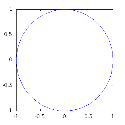
The trick here is that the command plot can return
a handle, and using that handle we can update the plot
in real time. We perform a loop for all values of b
(decreasing), update the values of the y and insert them into
the plot using set(h,"YData",y). The pause
prevents everything from happening too fast.
A last little piece of code, to show how beautiful mathematical plots can get:
> t = 0.0:0.005:50;
> alpha = 1.0;
> h = plot (cos(t),sin(cos(t/alpha).*cos(t)));
> axis([-1,1,-1,1],"manual")
> for i=0:200
>     alpha=1+i/800.;
>     y=sin(cos(t/alpha).*cos(t));
>     set(h,"YData",y);
>     pause(0.1);
> endfor 
You may be wondering how did I convert the pretty Octave shows into animated gifs one can use in a webpage… Well, you’re going to be scientists / engineers, find it out! :)